“The problem with this is there’s too much clutter.”
That’s what the legal secretary told me when we were studying her firm’s intranet home page. In fact, the page was pretty sparse in layout. The text was nicely laid out in a readable font, with different weights given to headings and body text. Overall, it was organized and readable. Cluttered just didn’t seem like the right word.
Yet, the legal secretary was quite firm on this. She wasn’t the only one. Half of the firm’s employees we interviewed used the word “clutter” to describe the page that looked anything but cluttered to us.
It might be tempting to rework this home page with more whitespace, more organization, more emphasis on the visual design. However, that wouldn’t have produced any better results.
Over the years, we’ve learned that users have a different meaning of “clutter” than the designers do. It’s not the visual design the users are reacting to. It’s the actual content.
The law firm employees were telling us that the page didn’t have links and resources they needed. The page was full of stuff — mostly things the firm’s marketing group wanted everyone to know — but very little of what was on the page helped the employees do their jobs. Everything they needed was on the intranet, and they knew it, but the home page didn’t lead them to it.
The page was cluttered.
Clutter is what happens when we fill a page with things the user doesn’t care about. Replace the useless stuff with links, copy, and content the users really want, and the page suddenly becomes uncluttered.

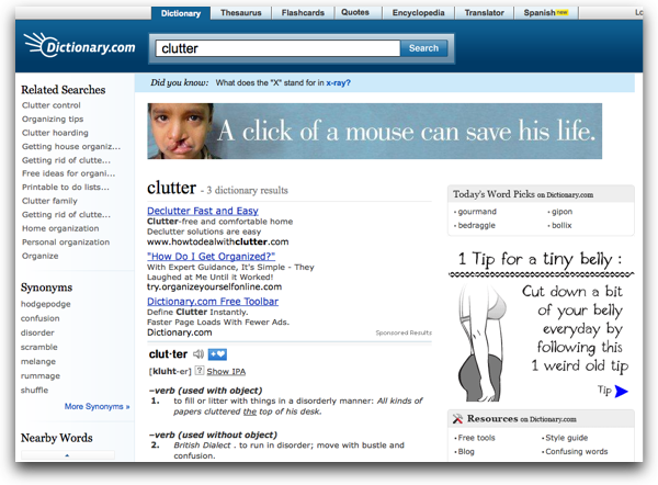
Dictionary.com’s definition of Clutter is found on a page, ironically, filled with clutter.
That’s exactly what we did at the law firm. Our design team uncovered those resources the users needed and organized the page to have exactly what the users needed to do their jobs well.
Those users loved the new page. In our evaluations, nobody used the word clutter. They used words like useful, helpful, and awesome.
Here’s the best part: We put the old and new pages side-by-side. The new page definitely had more text, less whitespace, and more dense information design. Yet, when we asked the users to tell us which one was more cluttered, they were unamimous: the old design was the cluttered design.
Are your users complaining about clutter? Maybe you should look at what they actually are seeing.
No comments:
Post a Comment